Editorial Dual-Axis Data Infographic
How to Create an Effective Infographic
Infographics are a powerful tool for communicating complex information in a visually appealing way. To create an effective infographic, follow these steps:
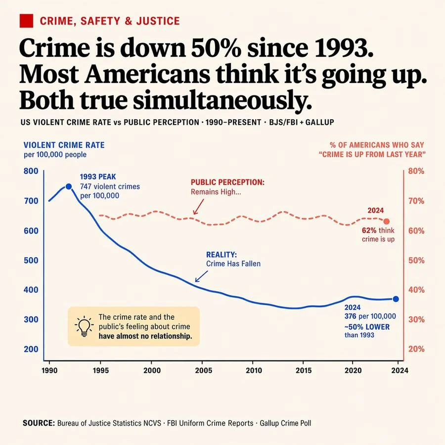
- Define Your Message: Clearly define the message you want to convey through your infographic. In this case, the message is that crime rates have decreased significantly since 1993, but public perception of crime remains high.
- Choose Your Visuals: Select a clean, newspaper-style design with a highly legible typography to convey a sense of authority and trustworthiness.
- Select Your Data: Use data from reputable sources such as the Bureau of Justice Statistics and the FBI Uniform Crime Reports to create a dual-axis line chart that showcases the relationship between crime rates and public perception.
- Annotate Your Chart: Add annotations to highlight key points, such as the peak crime rate in 1993 and the significant decrease in crime rates since then.
- Use Color Effectively: Use blue for the left y-axis to represent reality and red for the right y-axis to represent public perception, creating a clear visual distinction between the two.
- Add a Callout Box
A callout box is a great way to draw attention to a specific point or statistic. In this case, the callout box highlights the disconnect between crime rates and public perception.
Designing Your Infographic
Now that you've defined your message, chosen your visuals, and selected your data, it's time to design your infographic. Follow these steps:
- Set Up Your Chart: Use a dual-axis line chart with a clean, newspaper-style design and highly legible typography.
- Add Your Data Series: Add two data series: one for reality and one for public perception. Use a solid blue line for reality and a dashed red line for public perception.
- Add Annotations: Add annotations to highlight key points, such as the peak crime rate in 1993 and the significant decrease in crime rates since then.
- Use Color Effectively: Use blue for the left y-axis and red for the right y-axis to create a clear visual distinction between the two.
- Add a Callout Box: Add a callout box to highlight the disconnect between crime rates and public perception.
Conclusion
By following these steps, you can create an effective infographic that communicates complex information in a visually appealing way. Remember to define your message, choose your visuals, select your data, annotate your chart, use color effectively, and add a callout box to draw attention to key points.
Designing Your Infographic with GPT Image 2
GPT Image 2 is a powerful tool for generating high-quality images, including infographics. To design your infographic with GPT Image 2, follow these steps:
- Define Your Message: Clearly define the message you want to convey through your infographic.
- Choose Your Visuals: Select a clean, newspaper-style design with a highly legible typography.
- Select Your Data: Use data from reputable sources to create a dual-axis line chart that showcases the relationship between crime rates and public perception.
- Annotate Your Chart: Add annotations to highlight key points, such as the peak crime rate in 1993 and the significant decrease in crime rates since then.
- Use Color Effectively: Use blue for the left y-axis and red for the right y-axis to create a clear visual distinction between the two.
- Add a Callout Box: Add a callout box to highlight the disconnect between crime rates and public perception.
Final Tips
Remember to keep your infographic clean and simple, with a clear and concise message. Use visual elements to draw attention to key points and use color effectively to create a clear visual distinction between different data series.
Example Use Case
Example use case: A news organization wants to create an infographic to highlight the disconnect between crime rates and public perception. They use GPT Image 2 to design the infographic, following the steps outlined above. The final infographic is a clean, newspaper-style design with a highly legible typography, showcasing the relationship between crime rates and public perception.
Technical Requirements
Technical requirements: GPT Image 2, a clean, newspaper-style design with a highly legible typography, data from reputable sources, and a dual-axis line chart.
Conclusion
By following these steps and using GPT Image 2, you can create an effective infographic that communicates complex information in a visually appealing way.
Call to Action
Call to action: Create an infographic today using GPT Image 2 and start communicating complex information in a visually appealing way.
SOURCE: Bureau of Justice Statistics NCVS · FBI Uniform Crime Reports · Gallup Crime Poll
Category: Image Generation